 By
By 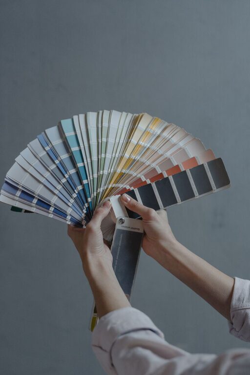
Creating a peaceful and inviting atmosphere in your home often starts with the colors you choose for your walls and decor. Calm colors can have a profound impact on how you feel in a space, helping reduce stress and promote relaxation. But with so many color options available, selecting the right calm shades can feel overwhelming. This guide offers practical tips to help you choose calm colors that suit your style and create a tranquil home environment.
Why Choose Calm Colors?
Colors influence mood and energy levels. Bold, bright hues can energize a space but might also feel overwhelming if overused. Calm colors, on the other hand, tend to be soft, muted, and gentle on the eyes. They help create a sense of balance and serenity, making them ideal for areas where you want to unwind — such as bedrooms, living rooms, or reading nooks.
Popular Calm Color Families
Before diving into tips, it helps to know some common calm color families:
– Blues: Soft blues evoke feelings of peace and stability.
– Greens: Nature-inspired greens promote relaxation and renewal.
– Neutrals: Shades of beige, ivory, taupe, and gray offer warmth without overpowering.
– Pastels: Light pinks, lavenders, and peaches can add a subtle softness.
– Earth Tones: Warm browns and muted yellows bring a grounded, natural feel.
Tips for Choosing Calm Colors for Your Home
1. Consider the Room’s Purpose
Think about how you use the room. Bedrooms benefit from calming blues or greens that help lower heart rate and encourage rest. Living rooms can also embrace neutral tones with subtle accents to create a cozy yet open feel. For home offices, light pastel hues may boost focus without distraction.
2. Use Samples and Test Swatches
Colors can look very different depending on lighting and room size. Always test paint samples on your walls and observe them at different times of day. Natural light shows the true color, while artificial lighting can add warmth or coolness. Testing helps avoid surprises once the entire room is painted.
3. Stick to Muted and Soft Tones
Avoid overly saturated colors if you want calmness. Instead, look for muted shades with low brightness and intensity. For example, choose a dusty blue over a bright royal blue or a soft sage green instead of lime green. These gentle hues are easier on your eyes and create a more restful space.
4. Balance Color with Neutrals
Even calm color palettes benefit from neutral “breathers.” Pair your chosen calm color with whites, creams, or grays to ensure the room doesn’t feel heavy or monotone. Neutrals can be incorporated through trim, furniture, or accessories.
5. Use Color Psychology as a Guide
While personal preferences matter most, color psychology can offer guidance. For instance:
– Blue can reduce anxiety and encourage calm.
– Green symbolizes harmony and nature.
– Beige and cream bring warmth without distraction.
– Lavender promotes relaxation and even creativity.
Combining these insights with what makes you comfortable will help create a personalized calm space.
6. Consider the Finishes
Matte or eggshell finishes are often better for calm colors because they diffuse light softly and avoid glare. Glossy finishes can be too reflective and visually stimulating, which may reduce the calming effect.
7. Coordinate with Existing Furniture and Decor
Look at the colors of your existing furniture, rugs, and accessories. Choosing calm colors that complement your furnishings helps create continuity and balance in the space. If your furniture has bold colors, a calming neutral wall color might offer the perfect contrast.
8. Add Texture for Interest
Calm colors can sometimes feel flat if used alone. Adding texture through fabrics, rugs, or wall treatments enhances depth without overwhelming the senses. Textured paint finishes, woven baskets, or linen curtains all contribute to a cozy, calming environment.
9. Use Accent Colors Wisely
Even in calm rooms, small pops of color can add personality and warmth. Choose soft accent colors that complement your base calm tones, such as muted coral cushions with a pale gray wall or a soft teal throw with beige upholstery.
10. Don’t Rush the Decision
Color choices have a big impact and can be hard to change. Take your time, gather inspiration from magazines or online, and live with sample patches before committing. This thoughtful approach helps ensure your space feels calm and welcoming for years to come.
Final Thoughts
Choosing calm colors for your home is a rewarding way to foster relaxation and comfort. By considering the room’s purpose, testing samples, favoring muted tones, and incorporating textures and neutrals, you can create a beautifully balanced environment. Remember, the most important part is selecting colors that make you feel at ease—after all, your home should be your personal retreat.
With these tips in mind, you’re ready to start transforming your space with calm colors that bring peace and joy to your daily life. Happy decorating!